
Can AI Actually Edit Text on Images Yet? I Tested Photoshop, Canva, and Midjourney on 5 Impossible Cases
Why changing a single word on a flattened JPG remains one of the hardest computer vision challenges, and how localized diffusion models finally cracked it.
Here is a scenario almost every designer, marketer, and developer has lived through:
A client or colleague sends you a finished marketing graphic—a .jpg or .png. The PSD file is lost somewhere in a legacy Google Drive. The original font is unknown.
All they want is a tiny change: swap "2024" to "2025", change "Summer Sale" to "Fall Special", or fix a typo on an AI-generated product shot.
In 2026, with AI models generating photorealistic 4K video from simple text prompts, you would assume changing four letters on a flat image is a solved problem.
It isn’t. In fact, it remains one of the most frustrating bottlenecks in digital media production.
To see where generative AI and digital design suites actually stand today, we took 5 challenging, real-world test images across different surfaces and benchmarked the reigning industry tools: Adobe Photoshop (Generative Fill), Canva (Magic Edit), Midjourney (Vary Region), and our localized typography diffusion engine, PhotoTextEdit.
Here is what happens under the hood—and why most tools still fail.
The Technical Dilemma: Why Is Editing Text on Flattened Images So Hard?
Before looking at the benchmarks, it helps to understand why modifying text on an existing pixel grid is fundamentally different from generating an image from scratch.
When an AI model looks at a word on a sign, mug, or poster, it faces three simultaneous computer vision challenges:
1. The Inpainting Destruction Penalty
Traditional generative inpainting tools mask out the target letters and predict new noise patterns. However, diffusion models treat text as general noise and textures, not typographic symbols. Without a strict font prior and structural constraint, the AI hallucinates random squiggles or misspells replacement words.
2. The 2D Overlay Trap
Tools like Canva or standard design suites slap flat 2D vector text on top of an erased patch. But real-world text isn't flat—it bends along ceramic curves, picks up specular highlights, and casts micro-shadows into paper fibers and wood grain. A flat layer looks fake immediately.
3. Perspective & Vanishing Points
Text on a street-level store sign obeys strict architectural vanishing lines. A 2-degree tilt error makes the edit look instantly amateurish and unconvincing.
Case 1: The Curved Ceramic Mug (Morning Sunlight & Cylindrical Wrap)
The Challenge: A morning photo of a ceramic coffee mug on a wooden desk. The original print reads "MONDAY BLUES" wrapped along the ceramic cylinder.
The Goal: Replace it with "MORNING BLUES", retaining the cylindrical wrap, ambient reflections, and sunlight angle.
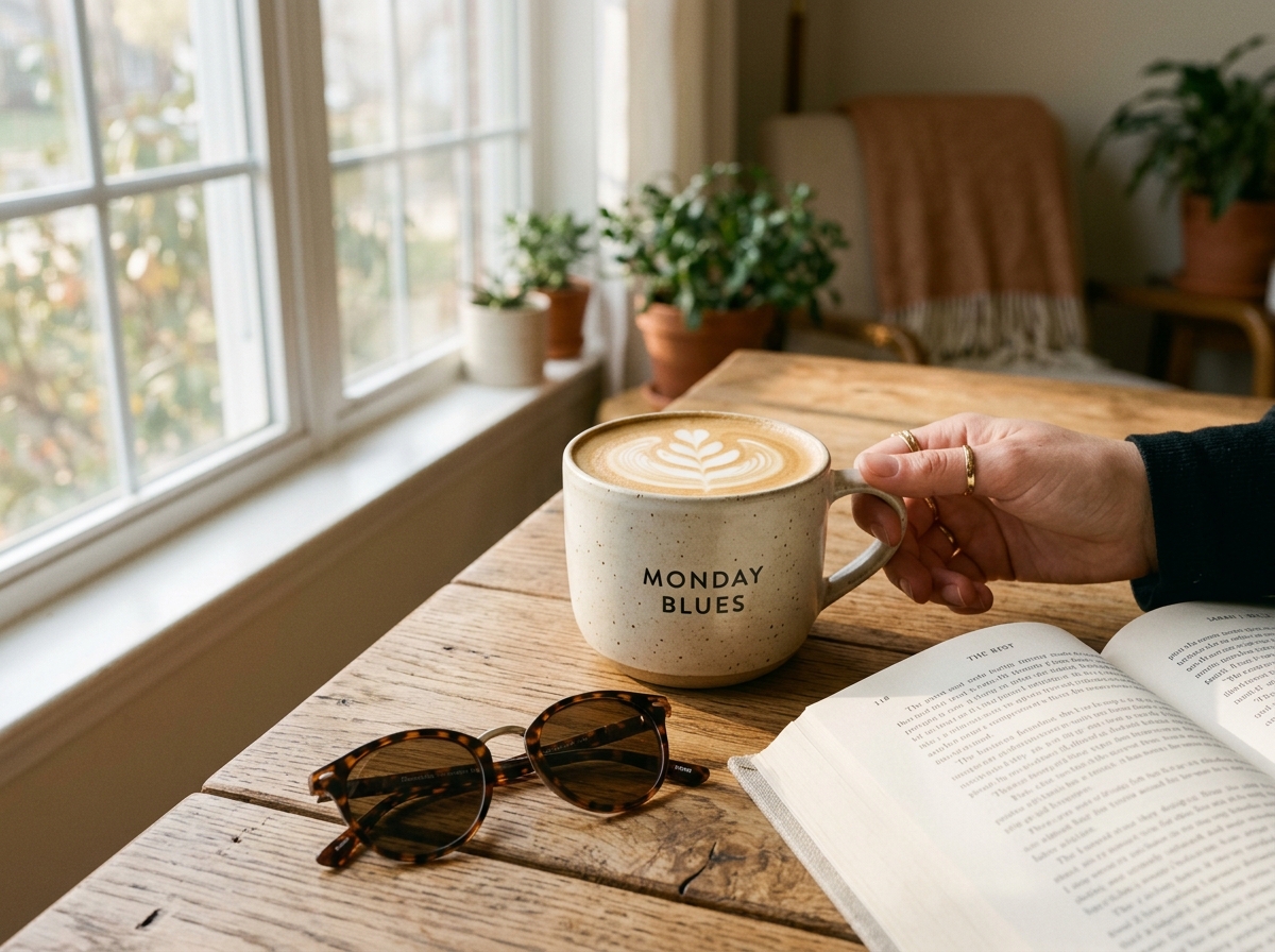
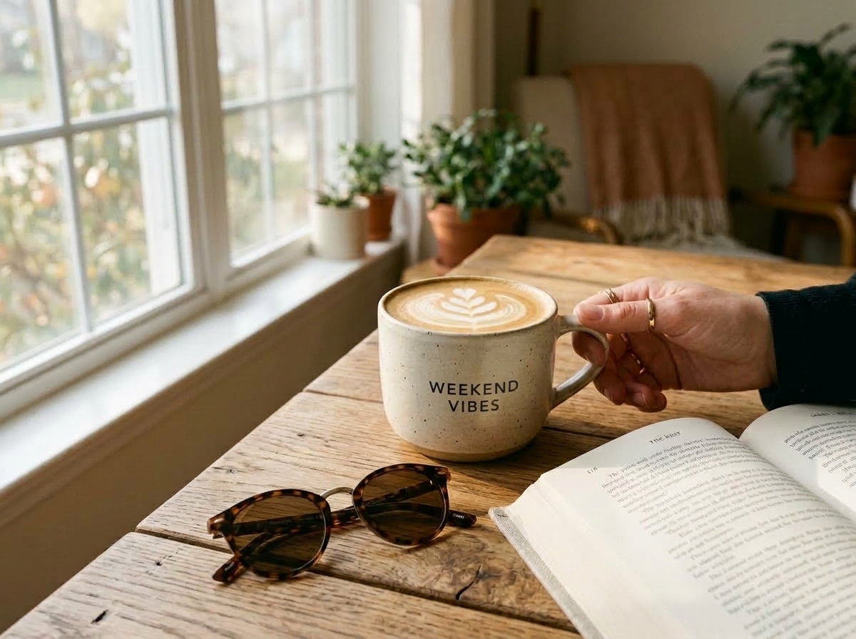
Tool Breakdown:
- Canva Magic Edit: Erased the text cleanly, but the replacement was a flat Arial-like font pasted onto the mask. It looked like an obvious MS Paint sticker.
- Photoshop Generative Fill: Attempted to regenerate the mug surface. When prompted to write "MORNING", it produced deformed letters with inconsistent stroke weights (
MORN-IING). - Midjourney Inpaint: Got the aesthetic lighting right, but re-rolled the coffee foam and hand position, ruining the original composition.
- PhotoTextEdit: Automatically detected the cylindrical curve, isolated the letter boundaries, and rendered the replacement in the exact vintage serif font with realistic ink bleed into the ceramic texture.
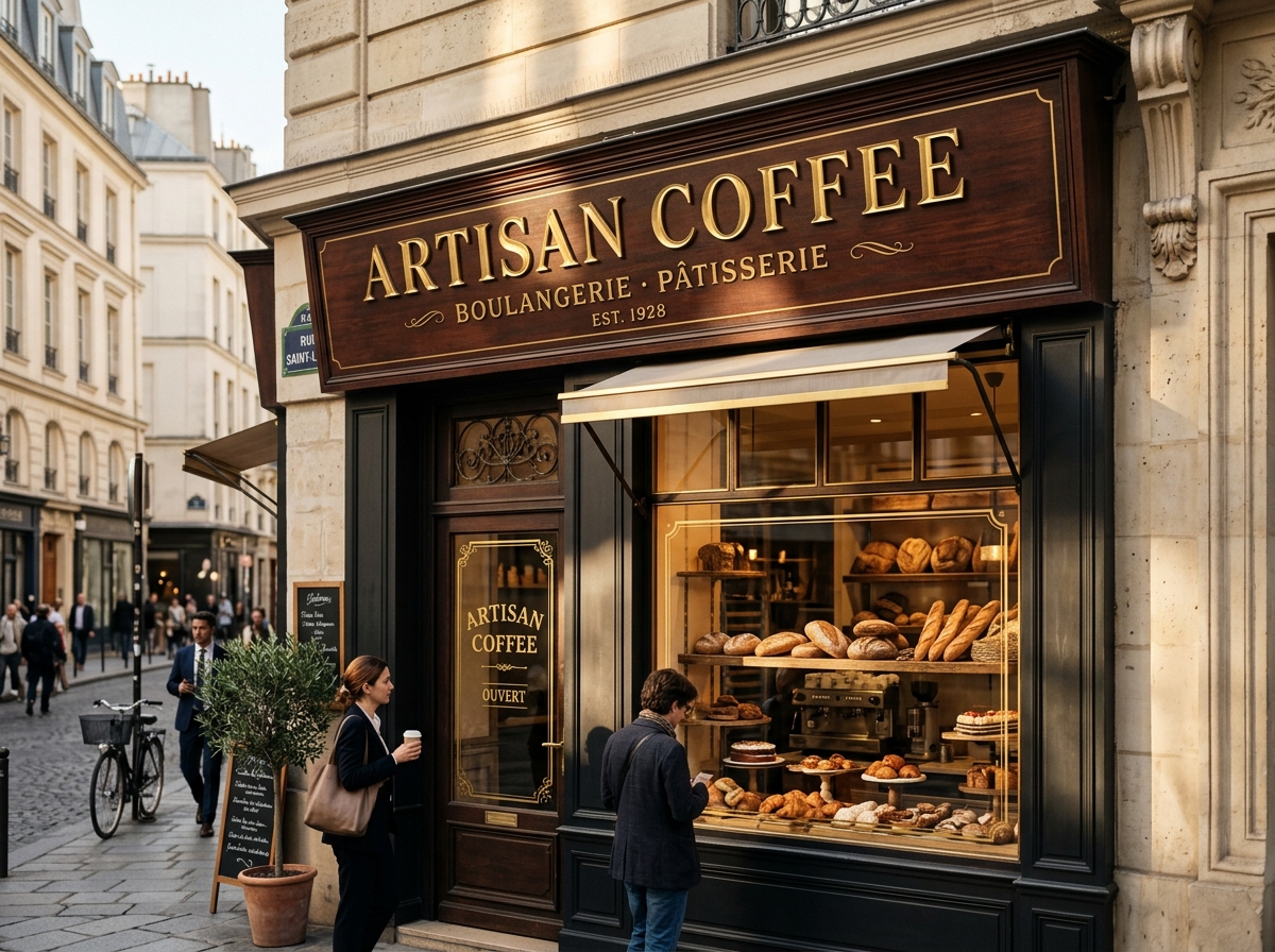
Case 2: The 3D Metallic Storefront (Architectural Perspective & Sun Angle)
The Challenge: A Parisian bakery facade photographed at an acute street perspective. The letters are physical 3D gold blocks with beveled edges catching sunlight from the upper-right.
The Goal: Change the 3D relief lettering from "ARTISAN COFFEE" to "GOLDEN BAKERY".
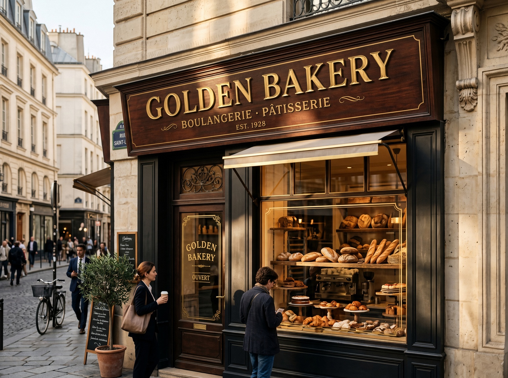
Tool Breakdown:
- The 3D Relief Problem: The letters aren't flat paint—they are physical gold blocks with a bevel, catching golden-hour sunlight from the upper-right.
- Photoshop Generative Fill: Produced plausible wood grain behind the letters, but could not recreate matching gold metallic bevels that matched the sun angle.
- PhotoTextEdit: Preserved the exact vanishing point along the vintage wooden cornice, rendering gold metallic bevels with shadows matching the existing facade light.
Case 3: The Wine Bottle Label (Curved Glass & Paper Texture)
The Challenge: A high-end wine bottle photo with reflections on dark glass and an embossed textured label.
The Goal: Update vintage year and region from "BORDEAUX 2018" to "NAPA VALLEY 2022" without distorting the bottle reflection.
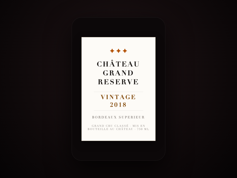
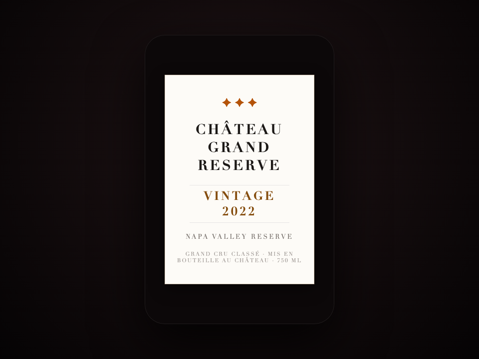
Tool Breakdown:
- Canva: Completely washed out the textured paper stock, leaving a flat white box around the replacement text.
- Photoshop: Required manual clone stamping, noise reduction, and custom font matching that took nearly 25 minutes.
- PhotoTextEdit: Replaced the text in 30 seconds while sampling the exact paper grain and gold-foiled typography.
Case 4: The App Store Screenshot (Subpixel UI Crispness)
The Challenge: Localizing an iOS app screenshot for the German and Japanese App Stores when the Figma project file was archived.
The Goal: Swap UI dashboard numbers and button text without introducing blurry JPG compression halos or mismatched font anti-aliasing.
Tool Breakdown:
- Standard AI inpainting models typically create soft, blurry edges around digital UI elements.
- PhotoTextEdit's Screenshot Editor rendered sharp, pixel-aligned vector-like glyphs directly into the UI card.
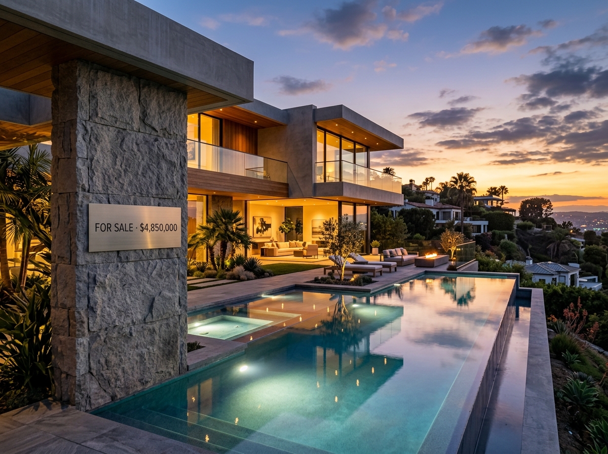
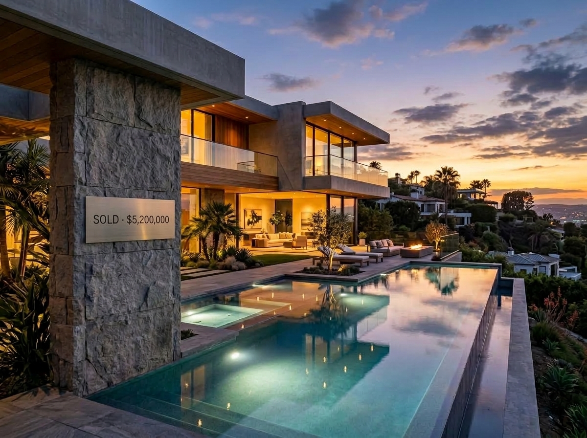
Case 5: The Outdoor Real Estate Sign (Lawn Perspective & Daylight)
The Challenge: An outdoor commercial property photo with a slanted lawn sign.
The Goal: Swap "FOR SALE" to "SOLD" while maintaining natural outdoor sunlight and grass shadow cast.
Case 6: The Vintage Event Poster (Paper Grain & Distressed Typography)
The Challenge: A vintage concert and festival poster with distressed paper texture and custom display typography.
The Goal: Update the event dates and headliner name without smoothing out the authentic 1970s print grain.


The 4 Current Approaches Compared
After testing across posters, certificates, wine labels, and mobile app screenshots, here is how the 4 main workflows stack up:
| Method | Fidelity to Original Style | Effort Required | Where It Fails | Best For |
|---|---|---|---|---|
| Manual Photoshop Retouching | 9/10 (Skill-dependent) | 30–60 mins | Finding obscure commercial fonts & matching compression artifacts | Professional retouching with unlimited time |
| Canva / Web Editors | 3/10 | 5 mins | No concept of lighting, shadows, or 3D surface depth | Simple flat flyers with white backgrounds |
| Midjourney / SD Inpaint | 5/10 | 15 mins (Rerolling) | Typo hallucinations and composition drift | Creative conceptual art where composition doesn't matter |
| Localized AI Editors (PhotoTextEdit) | 9.5/10 | 30 seconds | Struggles on extremely blurry or sub-50px micro-text | Product photos, signs, posters, and screenshots |
Key Takeaways for Builders, Marketers & Designers
If you are working with visual assets where the source project files are gone, keep these rules in mind:
- Stop re-rolling full generative prompts: If you already have 95% of the composition right, regenerating the prompt is a lottery ticket that wastes GPU credits and time.
- Prioritize Latent-Space Inpainting over 2D Overlays: Flat text overlays will destroy the visual realism of product packaging, physical signs, and realistic 3D scenes.
- The Future of Image Editing is Surgical: The industry is moving away from "prompt-to-everything" toward hyper-specialized, surgical tools that treat existing pixels with respect.
If you frequently deal with localized ad variations, product mockups, or fixing typos in AI art, test your own challenging image on PhotoTextEdit—it’s free to try and saves hours of tedious pixel pushing.